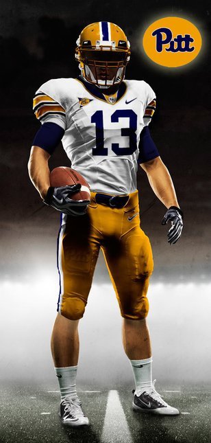
Some people can hop flights. Bounce around in cars to and fro. Pop in and pop out of home and anywhere else, and still stay focused and with it.
I, apparently, am not one of those people. Granted too much to drink and not enough to eat on Tuesday night contributed to that, but I think I would still be a bit off.
First announcement. There will be a liveblog tonight. I’ll probably kick it off around 8:15.
Second, more uni pictures will be below the fold.
In case anyone was unclear about this, Nike paid for my trip and hotel room. As far as I understand, they paid for almost all the media and bloggers in attendance.
The good thing about this, was some opportunities for casual meetings and talks with some Nike people and others. They were less than thrilled to find out that Miami had put out the press release a day early to reveal details about the uniforms.
At breakfast, I ended up sitting with Aaron Cooper, the designer of Nike’s Huarache sneaker and another guy from Nike. That was illuminating
We talked about the designing of the unis. The schools get a lot of input and that impacts exactly how much the uniforms get tweaked. Ohio St. and Alabama, for example, are very, very protective of their uniforms. So visually, very little was allowed to be done. It showed.
Schools like TCU and Boise obviously were willing to be much more adventurous with the designs. We talked vaguely about Pitt, he didn’t want to reveal much. I warned him that there was going to be a negative reaction from a large contingent of Pitt fans, simply because there would be no script or the old colors.
That seemed to surprise him, which suggested to me that the powers at Pitt never entertained the notion of going old-school. Something we had all known for a while, but many still held out hope to be surprised.
The heritage in the “Heritage” uniforms turned out to be subject to wide interpretation. Can’t say I’m surprised that yet another reference to Pittsburgh’s steel history. It may be tired, but considering the name of the pro football team and every story about Pitt and Pittsburgh team goes to the “blue-collar” well, what can we expect?
Honestly, I was surprised that I didn’t mind them that much. Individual elements I generally don’t like — throwing black in to the color scheme when it isn’t in the team colors, solid color tops and bottoms — but those are the modern/popular things in uniforms. There seemed to be a lot of positive reaction from other guys I talked to at the event to Pitt’s uni. I’m boring and old. That was why I thought the best uniform of the bunch was Oregon State’s. It was unanimous, though, on the hatred for Virginia Tech.
Don’t get me wrong, I wasn’t wowed. I just wasn’t disgusted by them. I did like the shade of blue, rather than the navy blue. And I actually like the helmet. The slight matte finish, was different. Considering one of the early ideas for the uniform was to make the jersey’s have a “panther-fur” pattern, this was better. I liked the jersey numbers and having them on the shoulder as well — the choice of color for them, though is a question mark
I still think the “Pitt” logo came off as a bit generic and sterile. The sleeves on the underlayer are supposed to be the Panther head. Because it is so oversized and wrapped around the arm, though, it is virtually unrecognizable. The use of black instead of gold, also meant that the only gold really noticeable on the unis are only on the helmet. Hopefully they will at least tweak the color of the numbers between now and the Backyard Brawl.
Also in the photo gallery are the Pitt version of the Huarache. Comfortable. The display pair was in my size. I debated whether I could pull off strolling off with them, but odds are they would have narrowed down who took it fairly quickly since the only other Pitt-related media there was Chris Peak from PantherLair and Tony Greco of PantherDigest.
(more…)


