Quick and unedited.
Initial impressions of the uniforms are this.
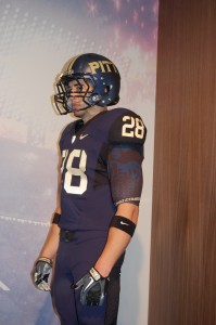
Not horrible. Usually not a fan of all blue, but this looked okay.
A little iffy on the logo. Sterile seems to be the best way to describe it.
I like the helmet. Not glossy, almost a matte finish with the silver flecks.
The good thing I will say is that they kept it simple.
I’ll have more later, but for now, the photos
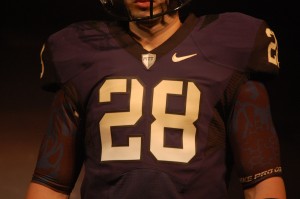
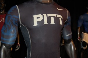
Jersey: Simple, understated, perfect color without too much going on. The script for the numbers is awful, but the color works with the jerseys. Grade: B-.
Pants: Simple. Monotone, but not bad. Grade: B.
Helmet: Were it not for the weird script, this would be an awesome helmet. Grade: B+
Overall: Weird font, otherwise, not much going on to complain about. Grade: B.
Ranked Pitt #3, WVU, #9. The winner? OSU
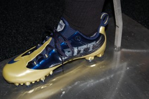
Where’s the gold? That tannish yellow sucks, there’s more pop in babies poop.
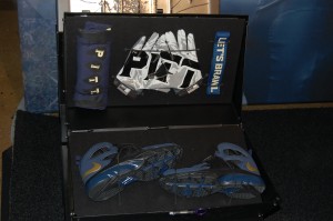
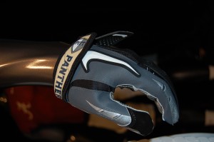
That blue is more black than blue. What’s with the black inserts on the sides of the uniforms. blue and what is the other color in the underoos? The gloves don’t match.
In summary the Pitt Nike uniforms have zero creativity and are monochromatic, dull and pathetic.
Things are not always black and white, unless you’re Nike.
Nike, letting the color-blind design uniforms does not qualify as hiring the Handicapped.
“Make everything as simple as possible, but not simpler.” — Albert Einstein
My question for Ruben Brown is: Why, Ruben, Why?

