masthead.jpg

switchconcepts.com, U3dpdGNo-a25, DIRECT rubiconproject.com, 14766, RESELLER pubmatic.com, 30666, RESELLER, 5d62403b186f2ace appnexus.com, 1117, RESELLER thetradedesk.com, switchconcepts, RESELLER taboola.com, switchconceptopenrtb, RESELLER bidswitch.com, switchconcepts, RESELLER contextweb.com, 560031, RESELLER amazon-adsystem.com, 3160, RESELLER crimtan.com, switch, RESELLER quantcast.com, switchconcepts , RESELLER rhythmone.com, 1934627955, RESELLER ssphwy.com, switchconcepts, RESELLER emxdgt.com, 59, RESELLER appnexus.com, 1356, RESELLER sovrn.com, 96786, RESELLER, fafdf38b16bf6b2b indexexchange.com, 180008, RESELLER nativeads.com, 52853, RESELLER theagency.com, 1058, RESELLER google.com, pub-3515913239267445, DIRECT, f08c47fec0942fa0
August 17, 2010

Possible Uni Look?

Filed under: Football,Marketing — Chas @ 6:36 pm

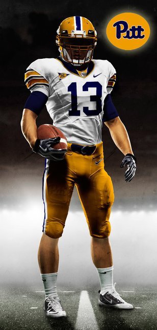
UPDATE: Putting this at the top to be clear to all who come to view. This is not the actual Nike Uniform. Reader JSS tracked down the actual source of the photo. They date back to at least December 2009. Ah, well.

At the risk of jumping the gun or simply posting a photo from someone’s photoshop wet dream or an EA Sports NCAA Football mock-up, I received this image a short while ago .

I think I could be quite happy to see that be the Pitt Pro Combat Uniform, “Heritage” series.


Something is very wrong with that 13.

Comment by Steve 08.17.10 @ 6:41 pm

Wet Dream! LMAO

Comment by POLE 08.17.10 @ 6:49 pm

Even Slippery Steve can’t deny how awesome this looks.

Comment by Pauly P 08.17.10 @ 6:54 pm

Gold trim around the numbers, please. But hot-damn, I hope this comes to pass, if only for a single game. Maybe against some Hoopies sporting this classic: link to en.wikipedia.org

Comment by Kyle 08.17.10 @ 8:15 pm

Why would the unis be white if it’s for the WVU game when we are at home?

That said, it does look awesome, anyone flipping the channels would instantly know Pitt was on with those.

Comment by Rob 08.17.10 @ 8:26 pm

Well, it’s on the same stock model that they used when releasing the Oklahoma procombat uniform last season. link to procombat.nikemedia.com

So is this a legitimate Nike photoshop test or a just a hopeful fan rendering?

Comment by Kyle 08.17.10 @ 8:36 pm

Wooooooweeeee!!!

Comment by dugdog 08.17.10 @ 9:08 pm

Can’t hardly even see the word “Pitt”. Shouldn’t that be more prominent?

Comment by Annie 08.17.10 @ 9:21 pm

this picture has already been debunked a few weeks ago

Comment by Jamie H 08.17.10 @ 9:24 pm

love it

Comment by Z-Boy 08.17.10 @ 9:42 pm

If true, that would be outstanding. To see the script again in a modern look with what I think are the true colors of Pitt football would be too good to be true. That said, that look will not be what Nike is putting out. I read somewhere it will be a modern look (one color scheme) with block Pitt still used.

Comment by Stan 08.17.10 @ 9:57 pm

This is not them, Chas. Sorry. This was done by someone on Chris Creamer’s site who is very talented.
link to boards.sportslogos.net

Sure, Nike could use this fellas template, but I’ve heard Pitt will be all blue for this uniform/game. (I’d much rather they bring back some form of this classic.) Also, I bet the Pitt slogan is “Hail to Pitt,” as it should be.

Speaking of that, Hail to PITT!

Comment by JSS 08.17.10 @ 10:28 pm

JSS,

Thanks for the actual source. I’m not surprised, but it would have been nice.

Comment by Chas 08.18.10 @ 12:04 am

Yo Hot Sauce, control yourself. Don’t get too excited.

Comment by Scoocher's Brother 08.17.10 @ 11:12 pm

The uniforms we have now are much nicer than this.

Comment by Reed 08.18.10 @ 5:28 am

Sorry Reed….our uniforms are lame. We need to go back to our “tradition” and quit screwing around with block letters and pug dog logos. There is NO national recognition of our current uniform scheme…NONE. As one poster said, EVERYONE will know that Pitt is on the field with this type of throwback. That logo in itself nationally conjures up memories of Tony Dorsett and Dan Marino. Ask yourself this…..how many “power” football programs insist on changing logos and/or uniforms away from their traditional looks? Can’t name too many, huh? The script logo NEEDS to come back for that reason. Imagine Georgia, PSU, Ohio State, USC, Texas, FSU, Michigan, going with anything BUT their classic logos and uniforms. You never see any of these schools d*cking around with new logos, etc. It would never happen. HAIL TO SCRIPT PITT!!!!

Comment by FlipToScript 08.18.10 @ 7:29 am

Guys I hate to throw the wrench in the calls for the “classic” uniforms…..BUT…..the navy and gold color scheme and block letters were used a lot earlier than the script, royal blue, and mustard yellow. So technically, the beloved script cannot truly be called the clasic Pitt uniform. It’s still an awesome uniform, just not quiet as classic as some people are saying.

Comment by ron 08.18.10 @ 8:16 am

I have to agree with FliptoScript, our current uniforms look generic, the script uniforms are unique!!

Comment by The Oakland Jew 08.18.10 @ 8:20 am

Great post Flip, but the only problem is that those programs you mentioned have a fan base that would have hung someone if something was done with their uniforms and logos. I maintain that we had one of the most unique and greatest looks (Script Blue/Mustard) in all of college football, but there was not a big enough outrage when it was taken away. I lie outside of the Pittsburgh area, in Big Ten country and when I say I’m a Pitt fan, half of the time I get asked “why did they ever change from that cool script mustard look?”. At least he current uniforms are the nicest since 1996.

Comment by Stan 08.18.10 @ 8:22 am

I think the administration needs to compromise.

1) Keep the current logos the same, change the color scheme to the mustard and blue.

2) Keep the color scheme the same, change to script logo.

I vote option 1

Comment by BnG 08.18.10 @ 9:18 am

Happy to help, but sorry to ruin the fun speculation. I hope we like the rendition that Nike comes up with for the Panthers. HTP.

Comment by JSS 08.18.10 @ 10:33 am

Nobody can kill a brand better than Steve Peterson and Lebron James….

Comment by Pauly P 08.18.10 @ 12:02 pm

see first paragraph

link to post-gazette.com

Comment by scoocher 08.18.10 @ 12:29 pm

Stan –
I was on campus when the logo change took place in ’97 and TRUST ME – no one liked the change and there WAS a student backlash. But we all knew SOMETHING needed to change with the athletic department as the football and basketball programs were both at rock bottom. Ask ANY Pitt Alum where they went to school and 100% would reply, “Pitt”. We should no longer be referred to by the national media as “Pittsburgh”. By going back to the logo when we last won a National Championship would give us much more national recognition and would lose the “Pittsburgh” tag. And furthermore, I can’t believe the University paid a design firm nearly $2 million to come up with the block letter logo. A seven year-old on Microsoft Word could’ve come up with the same logo by using Arial font, outline form, and arching it. Pathetic.

Comment by FlipToScript 08.18.10 @ 1:11 pm

Count me as one who does not like the old color scheme, except for throwback games. I think the navy blue and gold looks much better than mustard yellow, and the block Pitt logo looks just fine to me. I have never had anyone ask me about the old colors and script. It is/was not as nationally recognizable as Michigan, Ohio State, Texas, etc. Embrace the change; it’s been long enough.

Comment by NickW 08.18.10 @ 2:02 pm

Prior to 1972 PITT wore plain Gold Helmets ala Notre Dame & Navy. As far as I know they were pretty much the same color Gold as they are now.
I like the gold now, and the way it’s itched into the side of the uniforms on the jersey. I also like when they went all gold ala Georgia Tech for a game or two when Palko was QB. I much prefer the all gold look to the all white look of last year’s road games. And I went to PITT during the last ‘Glory Years’, 1976-1981, so of course I like the mustard yellow & old blue of that era.
Perhaps they can bring back the script Pitt for the helmets and keep the current gold & navy blue.
Or just use the ‘glory year’s’ uni for special occasion games. You would think Coach would eventually bring back the uniform he played in and the ones PITT last won the national championship in. Perhaps he’s waiting for a team ‘worthy’ of wearing them.

Comment by carolinapanther 08.18.10 @ 5:00 pm

With several versions of uniforms available why does Steve Pederson hate the Pitt script so much? Does he believe it’s cursed? We will all suddenly be transferred back to Pitt Stadium? The script is part of our history.

Comment by TonyinHouston 08.18.10 @ 6:16 pm

FliptoScript – have to agree with the posters above – I actually went to all those games in the ’60s and ’70s and can say that the uniform associated with the ’76 NC is not a ‘traditional’ uniform or color scheme for PITT.

Comment by Reed 08.19.10 @ 4:34 am

If they ever make it to a BCS title game, they need to switch to the script jerseys at half time Might Ducks style.

Comment by nabil 08.19.10 @ 1:54 pm

Powered by WordPress © PittBlather.com

Site Meter