It’s a minor thing compared to the on-the-field performance, but there were some noticeable changes at Heinz Field so far this year. I know some of the guys at CatBasket have been helping with suggestions and ideas for Heinz Field to be more of a Pitt home field. Sorry, ripping off “Sweet Caroline” from the Red Sox doesn’t work for me because 1) cheesy Neil Diamond doesn’t do it; 2) it’s just ripping off someone else’s gimmick; 3) as a Yankees fan, it set my teeth to grinding.
There are some hits like the great banner running behind the visitor sideline of Pitt greats through the history. Love it.
Then there’s the clear Pederson influence. The exiting the locker room and coming out of the tunnel camera for the Pitt team led by Coach Wannstedt before the game. That was a Pederson thing from the Harris regime. Then there’s the return of a certain logo.
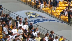
That’s right the gold and blue blob-cat is back and Jeff Long’s version appears to be out. The old panther head was the only one seen around the field. On the tunnels at the end of a couple banners.
It’s a little thing, but I must have missed the memo on the switch. Was there an official change? Looks that way. This brings up an issue that bothered me when I took a quick look at some Pitt gear in the stadium. The confusion and complete muddling of the logo.
Pitt really needs to just make a decision about old gear. There was gear for sale with all different Pitt logos (and I’m not even including the throwback stuff) — the “Iron bar Pitt“, the new/old panther head, the newer panther head, the old font with “Pittsburgh,” I even saw a couple of the panther tooth items. This extends to the Pitt official store (obviously, since I used their site to show the examples). Where the gear is just all over the place.
The first thing is that it reflects on the obvious cheapness of the merchandising arm not to just say, “screw it,” and ship the old clothing that didn’t sell to South America or some charity overseas. It also shows the general disarray of figuring out the logo.
They seemed to have gotten it right with the arched “Pitt.” I like it well enough. It’s simple and clean. It’s the dominate logo. Now, lose all the old fonts and junk from the past 10 years of misses.
Trying to figure out the right panther, though, has remained a mystery. I disliked both recent incarnations. Pederson panther head is a dense blot of blue and gold that makes my eyes hurt if I look at it too long. The Long panther-dog head was hardly an improvement.
I’ve thought the students have come out strong this year. I disagree with Kevin Gorman who asked, “What? You want a cookie?” It isn’t easy to build the student support when the team has performed the way it has in the Wannstedt era. The Buffalo game was more of a struggle than it should have been and that first game sapped a lot of energy and hope. In the 3+ years of Wannstedt, the biggest wins at Heinz Field were the opening night 20056 thrashing of what turned out to be a bad Virginia team (but at least it was beating a BCS team) and last year’s win over ranked Cinci.


